Case Study: Find Your Bus App
Summary:
My first portfolio project with Chegg Skills, the Find Your Bus app is a solution designed to streamline the daily commute experience for users by providing real-time bus tracking and accurate arrival predictions. This app addresses the challenges faced by commuters in accessing reliable and timely bus information at the “Washington & State” bus stop.
Roles & responsibilities:
UX/UI Designer: I served as the primary designer on this project.
Problem:
The traditional bus commuting experience is often plagued by uncertainty, with commuters struggling to access accurate information about bus locations and arrival times. This lack of transparency leads to frustration, delays, and an overall negative impact on the daily lives of public transportation users.
Audience:
The primary users of the Find Your Bus app are daily commuters who rely on public transportation for their daily travels. This includes individuals from diverse demographics, such as students, professionals, and the elderly, who share the common need for efficient and reliable bus services.
Solution:
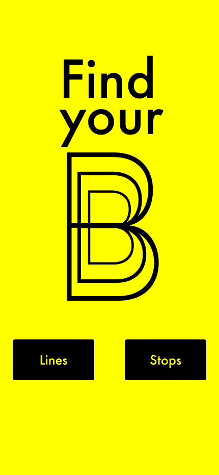
A simple, intuitive interface that allowed users to find bus arrival times by the Lines or Stops buttons.
Summary of research, data,
and how my findings drove the process
Research
My research consisted of competitive analysis, interviews with local bus riders, as well as developing a user survey. Using Google Forms, I created and sent out a Bus User Survey to friends and family asking about frequency of ridership, familiarity with “Washington & State”, any concerns around arrival times, as well as how people plan their travel journeys.
Simultaneously, I began looking at many transit apps, including Transit, Moovit, Citymapper, and Google Maps to get a look at the competition.
Transit strengths included an intuitive, non-overwhelming interface, easily accessible info for tracking bus lines, as well as a real-time map of my walking to transit (in addition to tracking the bus itself) Weaknesses, were mainly that the app requires payment and has paid features (however, I did like the explanation page which allows an offer to get a free membership by contacting them). An opportunity for Transit would be to provide driving directions, even if it involved some driving to transit, or options around parking near transit. Lastly, concerning threats, to stand out in the marketplace, the need to pay for Transit is a tough sell, considering many apps are free.
In interviewing some close friends who I knew rode the bus, my main takeaways were the desire for real-time updates, as well as a visual of the bus location. Also important was the ability to be notified about arrival times and the ability to save a favorite route (to work for instance).
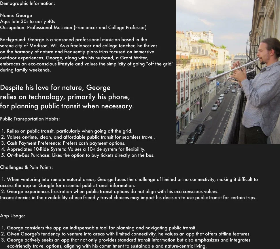
User personas
My research thus far aided in creating two persons, Angel and George, as they mirrored the data set of individuals I either interviewed or received survey information from.

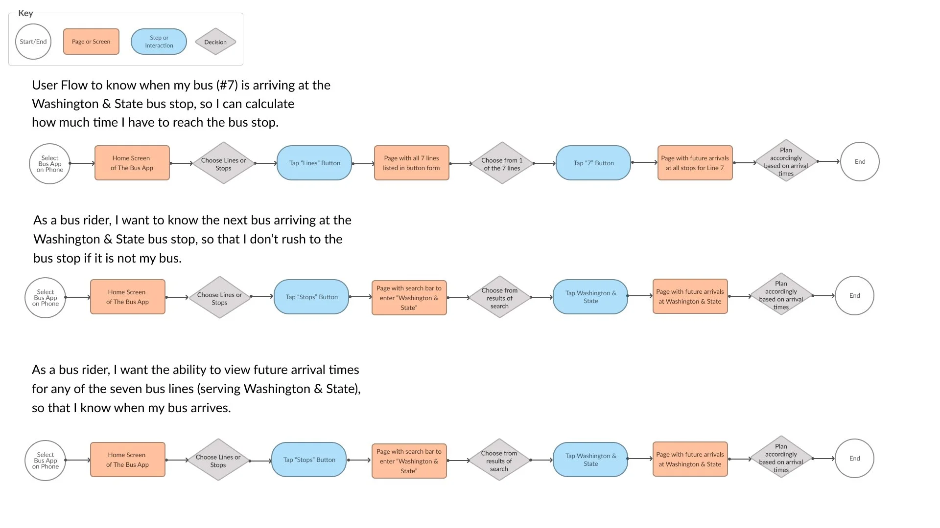
User Stories
In designing the user flow for the bus rider experience at the Washington & State bus stop, I considered the three key user stories below to ensure a seamless and intuitive experience.
1. As a bus rider, I want to know when my bus is arriving at the Washington & State bus stop, so I can calculate how much time I have to reach the bus stop.
2. As a bus rider, I want to know when the next bus arrives at the Washington & State bus stop so that I don’t rush to the bus stop if it is not my bus.
3. As a bus rider, I want the ability to view future arrival times for any of the seven bus lines (serving Washington & State), so that I know when my bus arrives.
In early sketches, I wanted to ensure the user who wants to know when their specific bus is arriving, had a clear and prominent button to select.
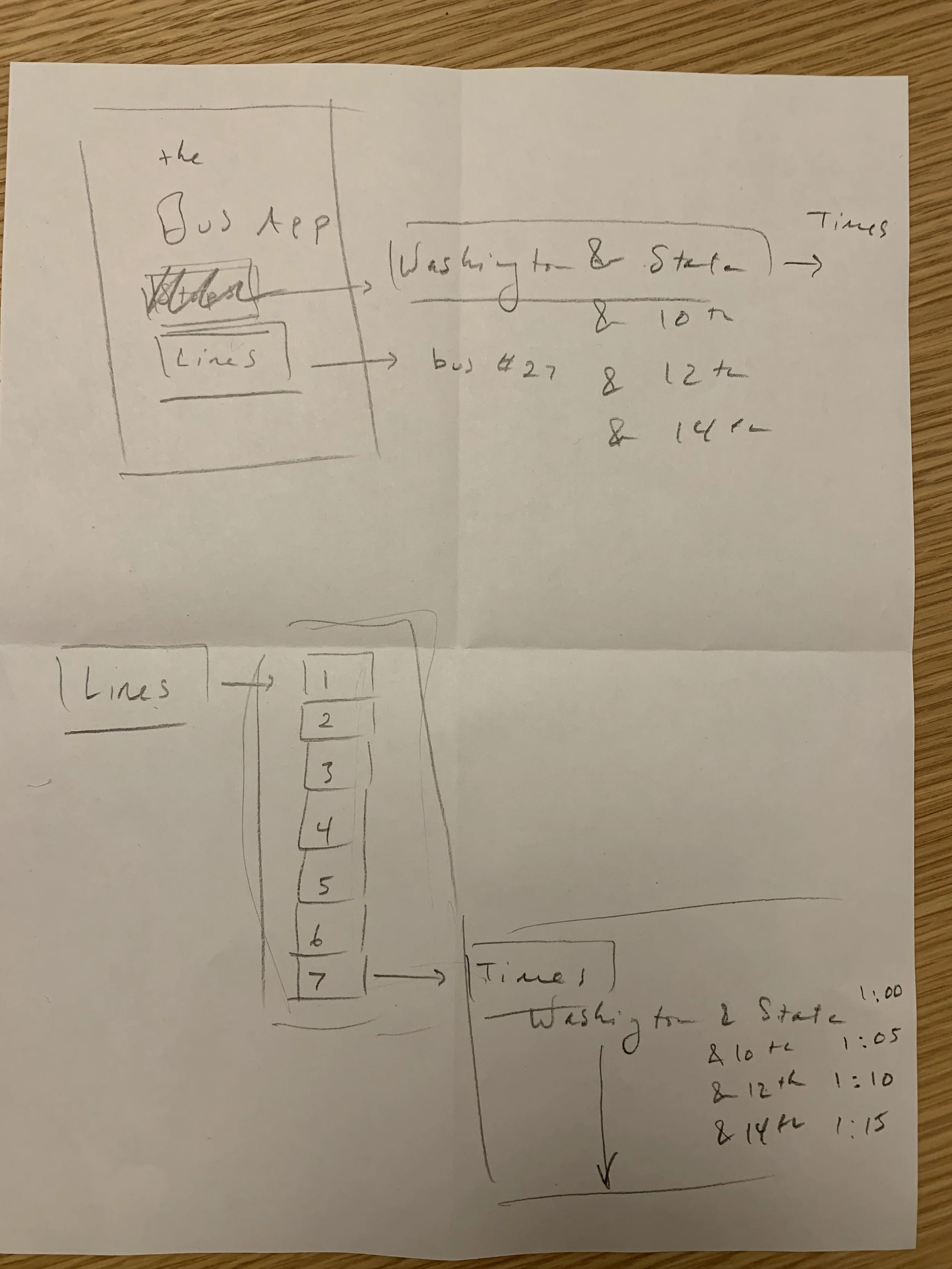
Next, for the user concerned about missing their bus, I sketched a feature that allows the user to select “stops” and see the next arriving bus at the Washington & State, or any other bus stop.
Lastly, to address the need for users to access future arrival times for all seven bus lines servicing Washington & State, I used Figma to ensure a logical progression, beginning with the user selecting their bus line or stop, viewing the next arriving bus and providing clear navigation options to access future arrival times for all seven bus lines.
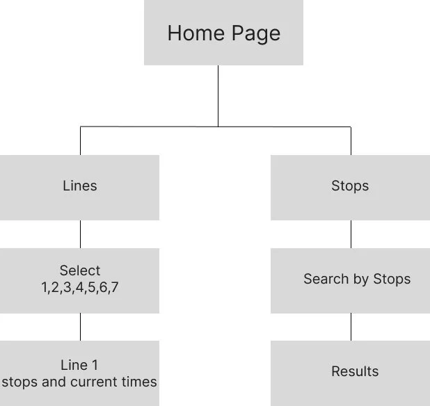
Content Strategy
With my user flows planned out, I now had a clear vision of the overall architecture of the app and created a basic site map in Figma.

Wireframes & Prototypes
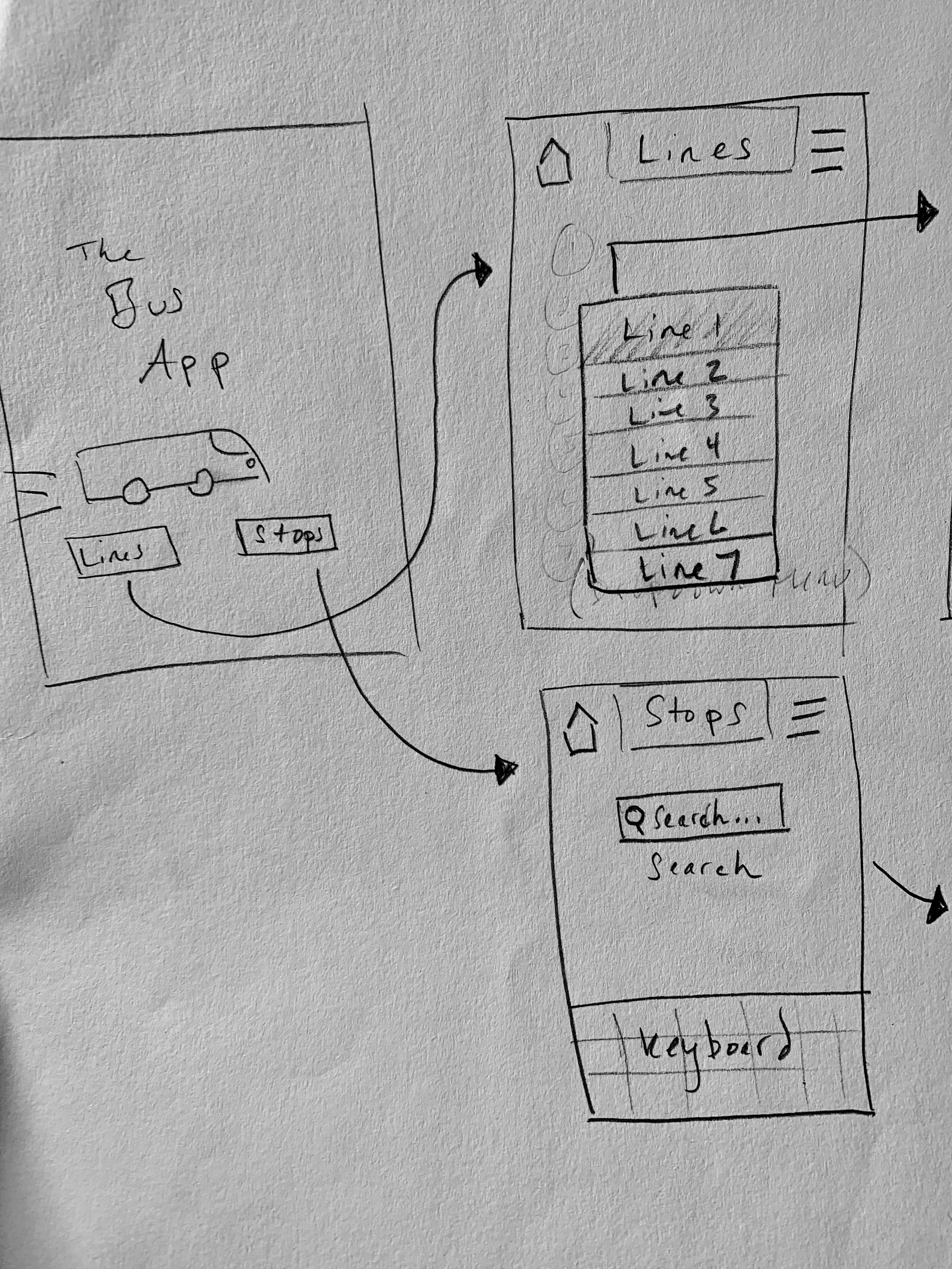
Next, I created some initial wireframes for the app in Figma, maintaining ease and clarity of navigation with simple elements.

My next iteration was designed for a more current model of the iPhone (model 14-15) which left me with substantial white space with which to work.

Before creating a more hi-fi prototype, I did some usability testing to fine-tune my users' needs. After obtaining consent for recording the session, I watched in real-time as my testers navigated the app and solved three tasks:
1. Find arrival Information at Washington & State Bus Stop.
2: Determine the time Remaining before bus arrival.
3. Select a bus line and view arrival times.
Encouraging them to vocalize their thoughts and note feedback, I was pleased to see all tasks completed in under 5 seconds. Other feedback included that the interface was clean, clear, and easy to use. The full results of my usability tests can be viewed here.
The hi-fi prototype made better use of the open screen of the newer iPhone, with larger fonts and buttons, as well as an intial concept for a logo:
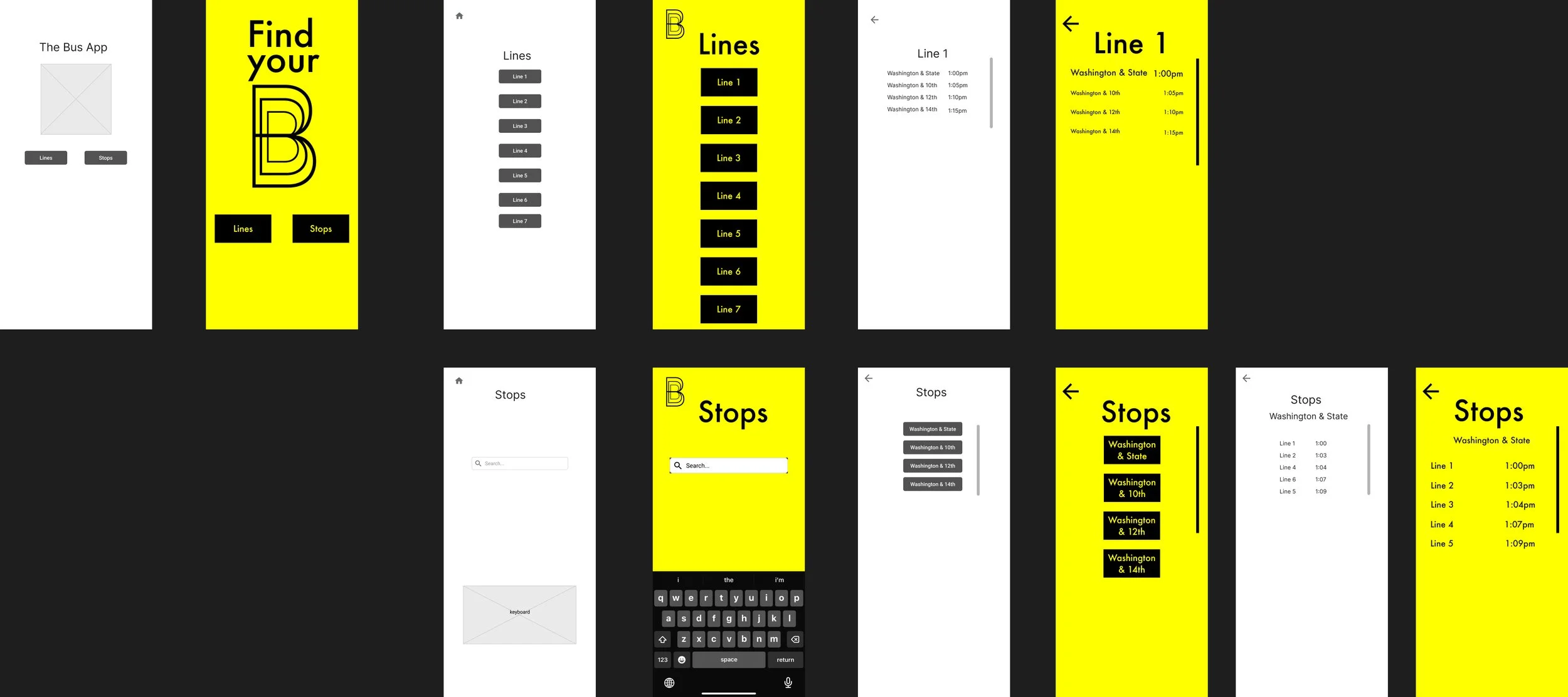
The final prototype fleshed out all the remaining pages and added a small step to replicate the experience of searching for a stop using the keyboard.

Clickable prototype!
Final Thoughts
Successes:
User-Centric Approach: Throughout this project, I prioritized user research, including surveys and interviews, to create detailed user personas (like Angel and George) and user stories. This ensured that the design addressed the specific needs and pain points of our target audience.
Intuitive Interface: I focused on simplicity and clarity in the wireframes and prototypes, using larger fonts and buttons for an intuitive user experience. The positive results from usability testing and user feedback confirmed the effectiveness of these design choices.
Real-Time Functionality: Addressing the key user need for real-time updates and a visual representation of bus locations, the app successfully incorporates features such as bus arrival times and a real-time map, aligning well with user expectations.
Iterative Design Process: My approach involved creating low-fidelity wireframes, conducting usability testing, and refining the design through iterations. This demonstrated a thorough and thoughtful design process, ensuring that the final product meets user needs effectively.
Learning Opportunities:
Market Analysis: While I conducted a competitive analysis, there's room to explore additional market trends, user preferences, and emerging technologies to enhance the app's features and stand out in a competitive landscape.
Monetization Strategy: My insights into the payment model of competing apps highlight an important consideration. Investigating potential monetization strategies for the app is crucial, balancing user expectations for free services with the need for sustainability and growth.
Inclusive Design: Ensuring that the app accommodates users with diverse needs, including those with disabilities or varying technological literacy, should be a priority. Conducting accessibility testing can identify and address potential barriers in the user experience.
Extended Testing: While initial usability testing was promising, ongoing testing post-launch can help identify any unforeseen issues or opportunities for improvement. User feedback after launch is valuable for continuous refinement.
Brand Development: While my prototypes include an initial concept for a logo, a more comprehensive brand development strategy could enhance user recognition and engagement.
In conclusion, the Find Your Bus app showcases strong user-centric design principles, addressing critical user needs in the public transportation space. By leveraging these successes and learning opportunities, I aim to further refine the app, ensuring its success in the market and continued user satisfaction.